Brands have been associating themselves with color since color was invented – which translates to since forever, basically.
Can you think of Coca Cola without thinking about red? Or Facebook without thinking of the color blue?
Color runs so deep in branding that Pantone – one of the world’s leading product color consultants – even has a shade of purple titled ‘Cadbury purple’ as a nod to the brand’s iconic purple logo.
With the recent Pantone trend color report for 2019 currently making rounds, what does color mean for your branding strategy in the upcoming year?
Colors may primarily exist to tint your vision and add interest and excitement to the life around you, but they’re more than just aesthetics. Brand recognition and brand recall are heavily associated with the color you choose to promote your brand with.
This is why your brand philosophy should align with the traits that are generally associated with your color of choice. Of course, these associations depend heavily on personal experiences, geographic location, and preferences. But there are some generalizations that can be made.
For example, red is associated with such things as warning and danger but also passion, excitement, and adventure. Green is most commonly associated with nature and therefore makes more experience to frame a more peaceful brand image. But that doesn’t have to be the case.
Take Mountain Dew – they took the color green and the motif of nature (mountains) and branded themselves as sporty and adventurous.
Same Color, Different Shade
Not all shades of the same color mean the same thing.
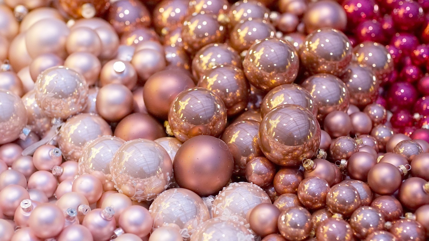
Pink can go from soft and feminine to bold and sultry as you move along the shade wheel. When choosing how to use color for your branding, you won’t just need to select the primary color but also pay attention to the shade.
Some colors can end up looking tacky if you choose the wrong shade and end up affecting the ‘vibe’ that you’re going for with your brand.
How Should You Be Using Color for Your Brand?
Colors signify meaning that much is clear. Whether this is meaning that is naturally occurring such as corresponding green with nature, or developed through careful branding – the fact is, using colors smartly can greatly affect your brand image.
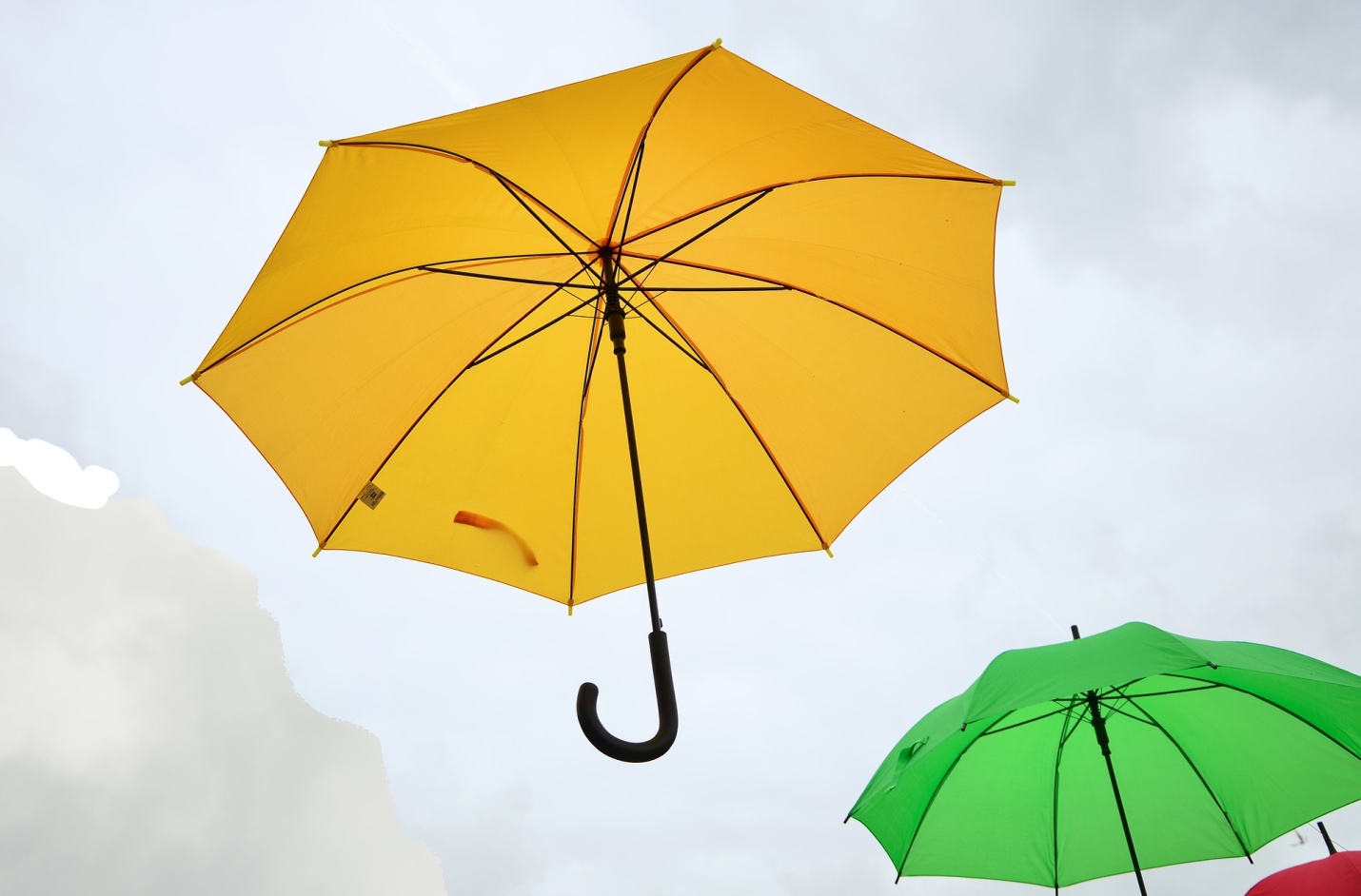
If you want to look at the trending color palette predictions for next year, the theme seems to revolve around joyful hues underlying the theme of empowerment and environmental awareness. Deep pinks, bright yellows, and mossy greens dominate the template.
Even if your brand already has a standard color palette, you can keep up with the trends through utilizing this palette in a number of ways such as promo products which will allow you to explore the palette without necessarily changing your own logo design.

